The language of paper and pastel
Every work begins with listening. Not to sound, but to the material itself.
Pastel and paper speak their own language, and only when they understand each other can something take shape.
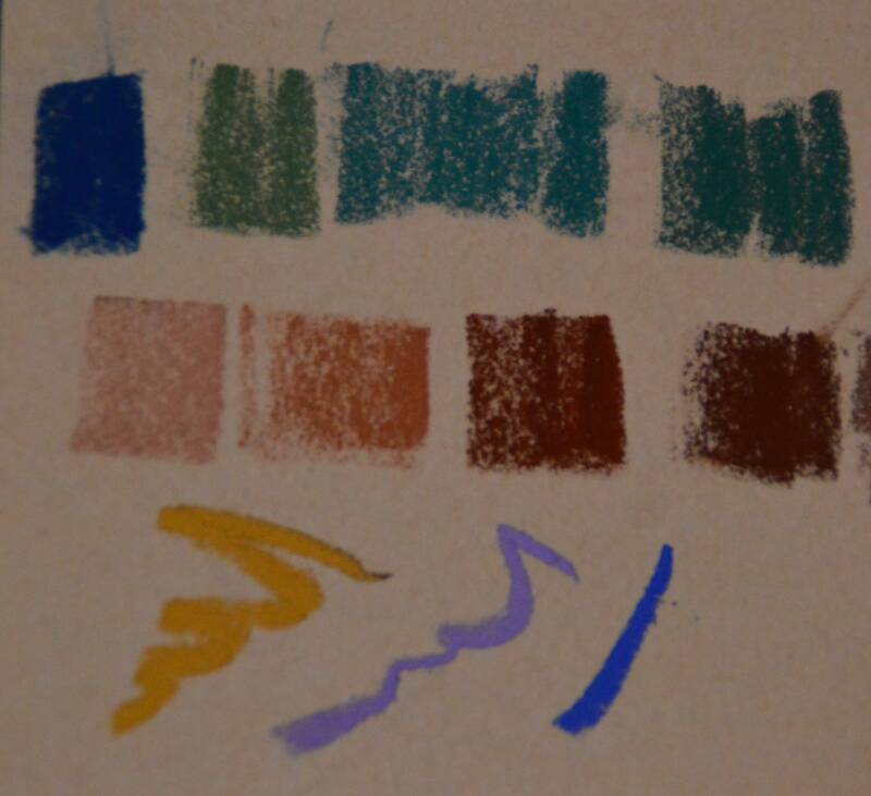
Soft pastels have a full voice. They sing in colour, reveal themselves immediately, but they also ask for a surface that can support them.
Hard pastels are more restrained, more precise. They draw the first lines, establish tone and structure.
And then there are pastel pencils — the quiet in-between voices that create connections, bring the whole together, or allow a detail to breathe.

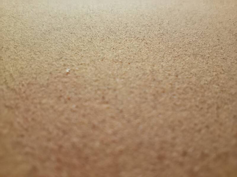
Paper is the foundation, but never neutral.
Every fibre, every grain responds differently to pigment.
On a rough surface, colour can settle in layers, while a finer surface allows for softer transitions.
Sometimes I choose a warm undertone, sometimes a cool grey or a light sand.
The colour of the paper influences what the pastel expresses — it is a conversation between surface and pigment.
That conversation is felt in every stroke.
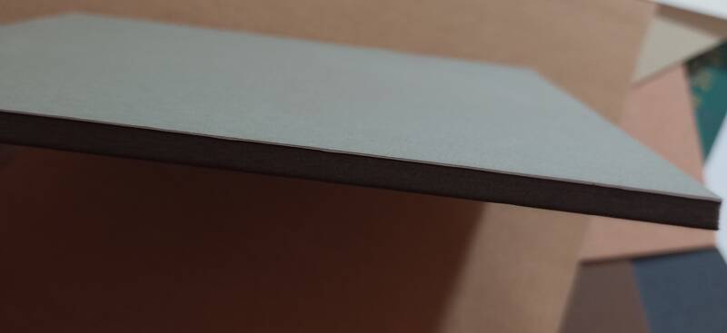
To avoid tension and distortion, I mount the pastel paper onto 5 mm foamboard using a thin adhesive film.
When pastel and paper find each other, everything seems to flow naturally.
But at times they resist, and a balance has to be found.
Too much pressure, and the tooth closes; too little, and the colour remains on the surface.
It is an exercise in listening, in moving with what the material allows.
Over time, you learn to trust that dialogue.
You no longer think in terms of technique or brands, but in tone and rhythm.
The pastel is no longer a tool, but a voice that speaks through the paper.
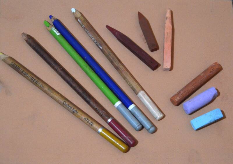
Materials I use
Soft pastels
Schmincke – very soft and powerful, ideal for velvety layers
Sennelier – creamy, luminous in tone and strong in light accents
Unison – natural, earthy colours with subtle transitions
Terry Ludwig – richly pigmented, excellent for broad colour passages
Blue Earth – harmoniously arranged tonal ranges, well suited for layered work
Hard pastels
Cretacolor – firm and precise, suitable for initial layers and tonal structure
Conté à Paris – clean, dry marks with good control, ideal for underdrawing and structure
Pastel pencils
Faber-Castell Pitt Pastel – fine point, reliable for detailed work
Cretacolor – slightly softer, works well in combination with hard pastels
Stabilo CarbOthello – smooth, easy to blend and soften
Paper and supports
Sanded surfaces
UART 400 – even tooth, rough and durable, suitable for controlled layering
Velour and fibre surfaces
Pastelmat – velvety tooth, holds many layers without the need for fixative
Canson Mi-Teintes Velvet – softer surface with fine grip, well suited for subtle transitions and soft edges
Brand names are mentioned for reference only, to indicate the materials used.